Pages

Sunday, December 23, 2012

Some things to work on (Monster of the Week)


I was watching a video about fundamentals by Feng Zhu tonight and was inspired to "brush up" lol.  It's amazing how no matter how long you draw, how long you paint, or how many miles your pencil odometer reads, the basics can always improve.  Lighting, perspective, gesture, color— as much as they seem like elementary principles, they are infinitely deep.

This was a quick sketch from last night that ended up looking not unlike a "Venusaur" from Pokemon lol, though that was not the conscious intent.  I learned a couple of things while working on it, simple concepts, but to me that's what makes them important.  The first thought (echoing advice given me by Justin Kunz recently) was that I need to focus on stroke control.  The second thought had to do with light.  I didn't use a spheretest on this one, and as a result wrangled for a while with my values.  They still have issues.  The thought occurred to me though, that the value patterns on a given isolated object are the sum of their lambert shading (spheretest-based lighting) and occlusion. Basically, in most situations everything lights as simply as a sphere, plus extra dark spots for the crevices.

And that was boring.  Here's an awesome:

Electric Eel Powers Christmas Tree

Monday, December 10, 2012

Life-Hack for Starving Artists


A great life-hack for starving artists! Make a sketchbook 12 times cheaper than some you might buy! After which I spend entirely too much time introducing my sketchbook stack . . . lol the next one will be shorter :)

Sunday, December 9, 2012

First Foray into CG Hair


This is my first attempt at CG hair, after watching a brief tutorial about fibermesh (ZBrush Hair) on the Pixologic website.  Hopefully President Eyring won't take offense . . . alright, time to go to bed; I'm teaching tomorrow.

Saturday, December 8, 2012

"Paris: City of Love and Mutant Catfish"* aka "The South Beached Diet"?

AKA also Monster of the Week :}

      So I was driving on Friday listening to NPR and heard a story that caught my curiosity.  Apparently, a species catfish translpanted to France from Eastern Europe in the 1980s has recently developed some rather radical feeding behaviors.  In their native environment, catfish are quiet, nocturnal, bottom feeders.  In the last 30 years, hower, their behavior has changed— they've started beaching themselves to attack pigeons in broad daylight.  Check out the video:


Wow, be careful where you walk your dog! The idea that these fish are changing so quickly intrigued me.  If their behavior could change so completely in 30 years, what will they look like in 30 million?  So I decided to do some doodles.  One of my favorite sketch games is "Projected Evolution"– basically, you take a creature and guess what it will turn into in umpteen million years.  A great example of this is the gorilla bats in the BBC's Primeval.  They project that some time in the distant future, bats will evolve into a ground-based superpredator that still operates by echo-location.  

Here's one way to play this sketch-game yourself–  you can take 2 very different animals and say "in 30 million years, elephants and rhino beetles will switch ecological niches."  Read up on what they eat, any particular behaviors they have, and look at pictures to learn what is unique about their anatomy and how it helps them survive. Then, as you draw, you start with the elephant's current design and ask yourself questions about what anatomical changes would need to be made for it to function as a matchbox-sized organism.  For one thing, elephants have evolved to have sparser hair than most mammals, as they easily maintain heat by virtue of their enormous bodies (partial mass homeothermy for you nerds).  If an elephant were to shrink, it would need more hair, as it would have much less mass to maintain heat.  Rhinoceros beetles are insects, which means the materials and structures in their bodies will only carry so much weight,  Even in prehistoric times, land based arthropods would max out at 2.5 feet (and those were scorpions, not insects).  What needs to be changed in the Rhinoceros beetle's body if it's going to be 13 feet tall and support 7 tons of weight?  What changes in the shapes of its legs will the elephant need to burrow and scurry? These are the kinds of questions that will lead you to new, creative solutions and fun creature designs.

Projected Evolution Doodles
The image above started as a 4AM flashlight doodle, which I played with more the next day.  I projected that the Catfishes' beaching behavior and desire for land-based food would lead it further and further on to land, paralleling the way amphibians developed in the Devonian period.  Its ray fins would become sturdier and stubbier to pull it along like a crocodile for excursions of increasing duration.  In the doodle at top left I evolved the catfish into an entirely land-based predator, but kept his fin because I thought it looked cool (which is allowed lol).  Obviously these aren't to be taken as serious scientific projections, but it's a fun exercise in creature design.


Listen to the aforementioned radio segment at TheWorld.org:
http://www.theworld.org/2012/12/pigeon-hunting-catfish/

See the never-mentioned cool spikily catfish picture:
http://www.aqua-fish.net/imgs/articles2/bristlenose-catfish-4.png

Watch as catfish tries to beat the unmentionable Dennis Rodman's NBA rebound record:
http://www.snopes.com/photos/animals/catchfish.asp

*Technically not paris, but the Tarn River in Southwestern France.  It made a better title Q:{)   (a frenchman with a berret.  Or a coonskin cap).

Friday, December 7, 2012

Proof of Concept


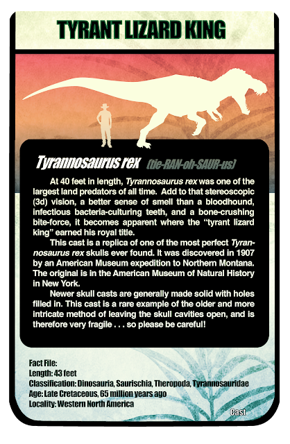
Huzzah for my first ever full body full color zsculpt!  He's a Camptosaurus dispar, one of the major land herbivores of the late Jurassic period.  We're looking at incorparating some 3d into some of the exhibits at the BYU Museum of Paleontology, and this is kind of a proof of concept :)  Below is the Camptosaurus I used for reference, which is on display near the main entrance.


PS— Time lapse video!


A time-lapse video of the sculpt.  My apologies, I forgot to press record at the last part, so it kind of jumps from 3/4-done to all-done.  With regards to the music—  http://www.youtube.com/watch?v=JFhGzwSN_aQ. Oh. yeah.


Thursday, December 6, 2012

First Round of Designs for PWN

     The first round of brainstorm sketches for our new senior film, which stars geeks, kung fu masters, and babies.  I am so psyched to work on this :)  These sketches are primarily face design ideas for the prideful video-game geek character, who gets his come-uppance from a controller-chewing toddler.

(Posted with Wes' permission)


Marshmallow Matey


As much as I love pirates, I've never understood what possesses advertising agencies to use them to promote their products.  Particularly those relating to food and hygiene.  One time in Wal-Mart I saw hanging on display  Pirates of the Carribean chapstick.  Nothing says "kiss me" like a yellowed pirate skull.  I mean, the thing didn't even have lips!    I can't imagine anything a skeleton pirate would be less qualified to sell.  Except maybe Citizenship in the Community merit badge booklets.  Also,  "Marshmallow Mateys".  I can get why the kids like it, the sugar+pirates= uncontainable hyperactive bliss. However, one would think that when trying to sell a parent on a sugar cereal it would be wiser to choose a mascot with more teeth . . . or a dentist maybe.  A fallen dentist, willing to sell his visage to promote the spread of oral decay.

This sketch was inpired by Allen Ostergar's pitch last night for the new BYU Animation department film.  Ultimately it was't chosen, but it had some fantastic ideas and lots of beautiful, beautiful, ugly pirates.  Awesome pitch Allen!

Tuesday, December 4, 2012

A learning experience


       This is a cover for a recipe book my writing class is putting together, with the "pencil-fork" sculpted in Zbrush/Blender and then photographic elements incorporated in photoshop.  There are lots of easier ways to accomplish what I did than the path that I chose, but I've been dying to learn more Blender and ZBrush and it was a good opportunity to do just that :)  You can't tell in the picture, but the noodles are alphabet pasta, which I thought could be a fun way to emphasize the theme.
     Before this point I had reached a certain level of modeling competency in Maya, so it was a humbling experience to start from square one (polygon one?) in Blender. The result wasn't the prettiest, but I got some basics under my belt.  Then, bringing the pencil into Zbrush, it was a fun opportunity to learn about materials and radial symmetry, which I hadn't worked much with in that program before.  It was neat to be able to sculpt identical designs on the six sides of the pencil at once :)  The tines of the fork got irreparably mushed when I up-resed the mesh ("splinched" for you Harry Potter fans), so the final image includes more of my photo-reference fork than originally intended. The final product definitely shows that it was a learning experience, but that's what counts!  I'm psyched to take the new skills I learned and apply them to future creations :)

Sunday, December 2, 2012

Christmas Devotional Speedsculpt


Wacom Intuos 3 Tablet and Zbrush 4r4

Happy December everyone, it's officially Christmas! er, season!

The Christmas Devotional/ Mormon Tabernacle Choir was tonight and I thought it would be fun to sculpt one of the speakers :)  This speedsculpt is of President Henry B. Eyring, first counselor to the Prophet Thomas S. Monson.  Mayhaps I'll put his glasses on at some point :)

A full version of the Christmas devotional and concert can be found free and legal at:

Enjoy!


Friday, November 30, 2012

Burrito


 In my subject's defense, his proportions are highly exaggerated, though I was kind to the burrito.  I witnessed this in the Wilk today.  I'm not sure what this guy's major was, but I'll venture to say sword swallowing; most units of measure have a fixed standard, but "bite-size" is a relative term.

Walt Stanchfield once said "let your sketchbook take preference over your camera."  At first it seems harder to capture a moment, an emotion, a character on paper than it is through a lens.  However, the point isn't necessarily to capture a likeness– it's to capture life.  Too many people treat a sketchbook like a curated exhibit.  It shouldn't be; if it is, you're losing most of the benefit.  Sketchbooks are for practice, to be sure, and they can contain nice drawings, but more importantly they are to stretch your imagination and capture life. Life isn't always likeness. Have you ever shown someone a photo of an experience and said "I wish you could have been there, the picture doesn't do it justice"? Now, technically the camera captured the scene with complete technical accuracy.  Due to the miracles of modern physics and chemistry, everything you pointed the camera at is represented with exactness.  What then is missing?  It's life, it's heart, it's emotion.  A good photographer will capture all of these things in an image– but not every time, and they will certainly not make every passerby stop to set up lights and have a 2 hour studio session.  No, they move in and through the experience, never stopping. They open their eyes wide and try to find the story in every moment.  A good photographer will snap hundreds of pictures in ravenous pursuit of the one that will immortalize the experience.  A good photograph isn't just for the eyes– you can hear, smell, and taste every element of the experience.   It's the same with drawing.  If you are seeking to capture life, it can't be done by mere likeness; there needs to be something more.  To catch it, you have to keep moving, and I mean moving. Too often I think we pick our subject based on who is sitting still long enough to draw.  That shouldn't be the deciding factor.  Try looking instead for where the life is, for which subject has the most interesting story.  Draw those people, even if your pen can't keep up with how fast they're moving.  The point isn't how pretty your sketchbook is anyway— it's whether you've caught a bit of life in your mind to breath into future characters.  At first these drawings will be nasty, as in pull-a-paper-bag-with-eyeholes-over-your-sketchbook-and-another-one-over-your-face-nasty.  This is a good thing.  It means you're stretching yourself.  And every so often, something nice will come out.  As you gain more experience, as your sketchbooks stack up, the number of nasty drawings between the good ones will shrink.  Best of all, your drawings will start, in some inexplicable way,  to come to life.   
     Remember, your job isn't to create an ink-jet likeness.  It's to "animate"– to bring to life. Sometimes you will want photographic accuracy, but often the most emotionally accurate drawing will be a caricature.

I've ranted long enough, but before I take off my "self-appointed-guru fez" I want to share one thing:
If you are at all serious about sketchbooking, buy this book.  The above link is a free preview on google book, which is a taste, but I would highly recommend getting the 2 volume set on Amazon. Best drawing book ever.

Ok, i need to sign out, my fiancee has confiscated my fez lol.  But no joking, get the book!  You will be happy you did.

Sketch Prompt


This one was a sketch prompt from a fellow student: "Disoriented Ocean Kangaroo of the Wasteland"


Those were a difficult few concepts to combine, but eventually I decided that 26 million years in the future kangaroos have evolved to be the dominant sentient life forms on earth,as well as becoming semi-aquatic. They can hold their breath for extended periods of time and grasp things with their baseball glove-like tail/fin (an adapted  "heterocercal" tail fin, which is a new word i learned the other day!). Far more technologically advanced than our society, they build futuristic atlantean cities in the deep. As for "disoriented", i put a GPS in his hands. My Dad's GPS always does a good job of disorienting him :)

Thursday, November 29, 2012

A quick sketch


Just a quick sketch, I think it has something nice though.  I'm working on the cover for a recipe book entitled "Eating Our Words" with my English class, and this is one of the development sketches.  I thought it would be fun to play off of the old elementary-school procrastination excuse "A dog ate my homework".  Maybe that's why they don't allow pets in college dorms . . . :)

I don't know that this is the direction I'll end up going, but it was a fun idea

Wednesday, November 28, 2012

Monster of the Week Nov 28 2012: Tapioca Golem


 Lol I was inspired this week upon review of one of my favorite childhood TV shows to try something new.  It struck me that the Power Rangers had fought a brand new villainous monster every week since I was 5– and I was curious if a list had ever been compiled.  It turns out that a certain self-sacrificing, saintly geek has been laboring for years, like a limner monk in a monastery, to compile a complete Power Rangers bestiary.  The resulting tome can be found HERE.  It turns out that in 19 American seasons (ie not including the Japanese show, which dates back to 1975) the effects artists on the Power Rangers shows have designed and fabricated 1026 separate monsters. Mind. Blown.

I thought about all the monsters in my sketchbook that never see the light of day, and how some of the earliest ones I ever drew were inspired by the Power Rangers'   "Monster of the Week" formula.  So here's one from this week :)

This first monster, true to Saban camp form, is based on my culinary arch nemesis: Tapioca pudding.  I always had my suspicions about tapioca; though I am not a picky eater I could never manage to stomach more than a few spoonfuls.  Maybe it's the texture, maybe some long forgotten traumatic childhood experience, or perhaps it's the uncanny resemblance tapioca has to this guy from the aforementioned show.  However, tonight after scanning the drawing I looked up tapioca on Wikipedia out of curiosity and felt justified.  Did you know the Tapioca plant is a natural source of cyanide?   Lol it's perfectly safe for human consumption, but I bet my 8-year old-self would have taken that bit of trivia and run with it.

Monday, November 26, 2012

Guava


(Digital speedpaint, wacom tablet and photoshop)

Happy thanksgiving! Random question: have you ever tried a guava? No, not mixed into a Sobe or fruit drink– have you ever eaten a plain-jane fresh-sliced guava? Okay, so between you and me, methinks it's an escaped strain of fruit from the inner sanctum of Willy Wonka's candy garden.  I'm not even kidding– this thing would make Gene Wilder flip out.  My fiancee's Uncle brought some that he had picked fresh near his home to Thanksgiving last week, and it was like eating bubble gum mixed with sweet tarts in a fruit. I'm no connoisseur, having been known betimes when in haste to eat unthawed hot pockets, but– amazing.

Okay, enough ranting about food, it's time to rant about painting.  Justin Kunz was kind enough to review my portfolio this last week, and was kind enough to give me a few suggestions.  The main one was to think more about my stroke, the way I lay paint down.  I like energy in images and tend to lay things down sporadically, which in my early drawings lead to a lot of "hairy" lines.  Gradually I learned  that the right, thoughtful, one line could contain more energy than the most frenzied six lines.  I think I may be starting to learn that same lesson in painting.  This painting doesn't necessarily have the most refined technique, but I was definitely thinking about stroke and massing shapes with stroke as I worked.  Thanks Justin!

Tuesday, November 13, 2012

Surgeon General


Lol as a kid I remember hearing about warnings from the surgeon general and imagining something of this nature . . . oh the wonders of the English language :) Look out man, he'll hunt you down, blow you up, and then give you a shot!  Of course, if you survive all that he'll give you a grape flavored lolipop . . . :)

Friday, October 26, 2012

Progress!


Howdy blogfolk, I'm on a deadline so I'm posting as I go tonight to help stay motivated.  Pencils are all done, now to vanquish colors!


"Path of the Feather" Pages 2 and 5!

More colors for a short comic I'm doing, which will be part of the book Reality Not Included. Stay tuned!


Dinosaur Spelling Bee


A flyer I made to for the BYU Museum of Paleontology, for a promotional event I'm helping to coordinate.  If you're in the Provo area, come join us!

Saturday, October 20, 2012

War of the Worlds (a birthday speedpaint)


Thank you for the birthday wishes everyone!  I'm so blessed to have so many great friends :)

This is a speed-paint from last night, touched up slightly this afternoon.  For my birthday, my fiancee and I (and the Fiasco Crew ;)  ) listened to the old radio broadcast of The War of the Worlds, the idea being to listen to the descriptions and sketch/paint from imagination.  Way fun.

More Gorilllas!

More work for the Oz concept, redone from (link) to better convey Nikko's character.  Sam gave me some more notes on this one, which hopefully I will apply soon

Monday, October 15, 2012

Exploratory Fighter Ship Sculpt


 An exploratory sculpt for a short film I've been doing concept on (these guys).  I'll give you updates as I can, I'm pretty pumped for this one :)

(Posted with permission of the filmmakers).

Tuesday, October 9, 2012

Color Study: Nikko's Anguish


A redesign of the flying monkies from the wizard of Oz, incorporating some of their oft-forgotten backstory.  I kind of like it, maybe I'll come back and finish it eventually, but for now i'm leaving it rough

Cabbage Creature


1/2 man, 1/2 lizard, 1/2 fish, 1/2 cabbage–  a creature so beastly, it defies the laws of fractions!  This one was kind of stream of consciousness lol :)

It's October, and I think I may have monsters on the brain . . . hold on to your poppin'-corns, this may not be the end ;)

Monday, October 8, 2012

"Reality not Included" Illustration– Cowboy Centaur


Lol this one started as a doodle in class from a few months ago, I kind of liked it so I scanned it but never got around to posting.  I came across the scan of the pen drawing this last week and decided to paint it up :)

Along with the short comic I've been working on, this will be my contribution to the BYU comic compilation project "Reality Not Included".  Basically, students from the animation and illustration departments are coming together to make a rad art book to take to a big entertainment industry networking even later this year :)  We can use all the support we can get!  Our basic publishing appears to be covered at this point, but we can still use help.  If you're interested, we are still taking pledges up through October 13th at:

Our Kickstarter Page

Even if it's just a dollar or two, every little bit counts.  And there are great pledge incentives, from copies of the book to original art! check them out on the right side of the page :)

Tuesday, October 2, 2012

Sunday, September 30, 2012

An olde experiment


This was a piece from last . . . fall?  2d Design Class.  Methinks . . .

The subject is James Goldberg, a BYU professor who is highly active in the local and Mormon art communities.  His other credentials include alsoplus being a way cool guy :)  He has the best gestures, I was sketching him all the time in class lol.  He was a good sport, and very kind to allow me to do the painting.  Thanks again James!


Saturday, September 29, 2012

Old Biker

This one's from a couple of months ago, but I just never got around to posting it lol

 Emily and I took a trip with my family to visit Devils Tower this summer, which was an absolute blast!  It also happens to be a tourist hotspot on the way to Sturgis, South Dakota where they have an enormous motorcycle rally every year.  So many interesting characters!  I mean that of course, as an artist, and in the most endearing possible way.  I wish I could have stayed all week just to sketch bikers . . . :)

The Prospector


This one was kind of stream of consciousness lol, but fun.  And fun. :)

The basic thought is that he's looking for a rare mineral inside of an asteroid honeycombed with tunnels.  He's a member a hardy alien race with an uncanny ability to discern the properties of substances by touch– hence making them very good miners, prospectors, and chemists.  They spend a lot of time underground, and have developed both biologically and technologically to a subterranean environment.  While not unintelligent, the enlarged forehead is not brain mass, it is primarily bone– a thick pad that acts as a shock absorber in the event of a cave-in.

Because he works in space, there is very little gravity or heat.  Still, he needs physical contact with the rock in order to do his work.  Instead of a traditional space suit,  he wears on his back a localized gravitational unit.  The pack houses a very small and specially shaped piece of neutron star to lock atmosphere and heat close to his body when he leaves his ship.  As gravitational force exerted on objects closest to the source increases exponentially, and the core of the apparatus is located next to his lower back, the pack must also act as a protective brace. It uses physical support and advanced counter-gravity technology to prevent the gravitational force from causing strain or injury.

Friday, September 28, 2012

Final Sign Design!

Hip hip hooray! Hip hip replacement!  I've got the go ahead to prep for print with the final sign template!  The text may change a bit on this one, but other than that :) Now to crank out about 40 more of these puppies . . . lol :)

Thanks so much to everyone who gave their input a few weeks back, you really helped determine the final look. Stay classy!

Wednesday, September 26, 2012

An Announcement :)


Most people never even get to see an angel, but this Saturday one agreed to marry me :)


Nerdy jokes aside, I am so absolutely blessed :)  Emily is my best friend in the whole world, and I am so psyched to spend all eternity with her :)

So here's the story:  We hiked Bridal Veil Falls with some of our best friends, who were of course all in on the plot :}  At the top, near the falls, we found an abandoned guitar and proceeded to "search" for the owner.  Of course, no one claimed it, as the guitar had been provided by my sister and planted by our cousin Joseph lol :)  Finding a dry spot, we opened up the case to look for some kind of identification.  We found a capo, a tuning pipe, a guitar stand, and my roomate Garrett Parker "found" a camera.  Supposedly fiddling with it, he began filming :)


(sorry about the noise, waterfalls tend to . . . make it. lol :) My buddy Jameson and I did our best to tone it down)


'


Lol afterwards, as we were both totally soaked, Emily's roommate Jayne presented emily with a change of clothes she had smuggled on the hike and the two of us completed the evening alone together at The Roof restaurant in Salt Lake City, then with a walk around Temple square.


Next to our table in the roof restaurant (image re-composited from 2 photos
in the same spot to compensate for flash lighting on window.  sometimes
it's convenient to be a nerd lol)


Flying Monkey Material Test


A quick and dirty materials rendering test for Sam Nielsen's class.  Honestly kind of just threw this one down . . . it could use some more love, which I hope to give it on the final version.  I learned some things, though :)

Tentative colors for page 4!


These are the tentative colors for page 4 of Path of the Feather, my contribution to the upcoming compilation comic Reality Not Included.  I'm so psyched!

Character designs for a new comic


I posted these some time ago on the Reality Not Included blog, along with a complete script, but for some reason never put them up here :}  I figure that since I'm going to be posting the finished pages here over the next couple of weeks I had better get some of the concept up.  Enjoy!

Synopsis: A young boy is sent by a shaman on a spiritual quest to learn the nature of destiny

Friday, September 21, 2012

This Sketchmonkey went to market . . .


A few sketches from the aforementioned farmers' market :)

(A composite of moderately cleaned up sketches from several different pages)

More than you ever wanted to know about glowing sheep cheese


This was kind of a fun study of some cheese I bought when my girlfriend and I visited the farmers' market by Lavell Edwards Stadium today.  I had been looking for an opportunity to study sub surface scattering ( [Readin' Words][Video]), and this seemed like the perfect subject to work with in a controlled setting.  Lol I know normal people buy cheese to actually eat it, but ;)  Placing a light directly above the cheese, I was able to see the light's effects on the material at various textures and depths.  Best of all, because of the uniform consistency of the cheese, the smooth surface of the cut, and having the light angled from behind, I could see exactly how deep the light was penetrating and how it changed the color temperature. Ok, enough nerd talk ;)

The guy at the farmers' market said that the cheese comes from a sheep, and as I recall the particular variety starts with a d . . . Derby? Daphnia?  Delouse?  [Link]  Daddy Long Legs?  I suppose it wouldn't be daddy long legs cheese if it comes from a sheep, would it?  Ha . . . everyone knows daddy long legs cheese comes from daddy long legs.  Like, seriously.


So, we did eventually eat the cheese, in a lovely meal my girlfriend cooked with pasta and peaches of all things, which turns out to be a really good idea.  Like, no joke :)  However, my highly cultured better-half (who knows some pretty cool Frenchy words about cheese) had to explain to me that you do not eat "le croĆ¼te", or the crust of the cheese, because that is basically mold.

P to the somewhat related S:
An interesting video about the visual aspect of food- [Link]